
Stone Mountain
Commemorative Half Dollar
Final
Design Issues


The Coin
Original Design
Modifications
Final Design
Production
A Tale of Five A's
Variations
Obverse Dies
Reverse Dies
Harvest Campaign
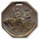
Counterstamp
Varieties
We believe that the final design for the coin is poor and there are many contributing factors. Borglum's conflicts with the SMCMA, the U. S. Commission of Fine Arts, James Earle Fraser certainly contributed to the final design issues. But the SMCMA certainly lacked both management expertise and had no experience in coin design.
Also contributing was Borglum's attempt to translate the mountain carving to the coin without modification. Once he started down this path and dug his heels in with the Fine Arts Commission it seems that there was no turning back. From that point on all changes to the design were based on his model and no one said they should just start over.
If you are from the South, or knew about the monument then the coin can be interpreted more easily. But with the passage of time, and for others without a direct connection, the significance of the design can be lost.
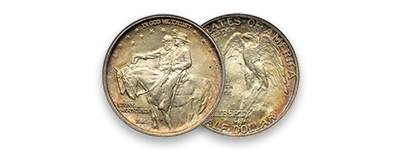
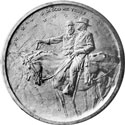
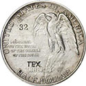
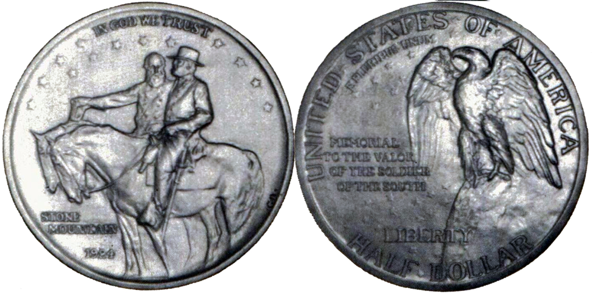
Obverse Design Issues
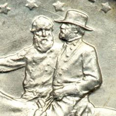 The obverse of the coin is lacking the sharp detail we are accustomed to on U. S. coins. The figures of Lee and Jackson are too soft and lack detail even on many high-grade coins. Because Borglum was trying to recreate the mountain on the coin there is no real definition between the devices and the fields. To make matters worse, the fields are not flat to allow easy repolishing. Graders seem to struggle with the issues and have to rely on high point wear on Lee's leg and glove.
The stars do interpret well, but could be larger given all the space. They do not seem to be damaged when dies are repolished.
 The letter style that Borglum chose for the date is also an issue. It does not strike well and has too many script type curvatures in the numerals to strike sharply. The wording of STONE MOUNTAIN and IN GOD WE TRUST is in a better type style but seem to strike too softly to create definition.
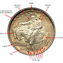
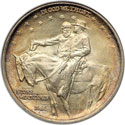
Reverse Design Issues
We think the reverse design is artistically one of the better commemorative coins of the era. But from a practical standpoint it leaves a lot to be desired. 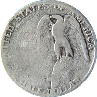 As mechanically bad as the obverse is, it is much better than the reverse. There are some things to learn about coin design and construction from the mistakes, and Fraser was right to object to the design.
The design of a coin works best when the high points of the devices are in the center of the die. This insures that as the coin wears, assuming somewhat even removal of metal, the loss of detail will be somewhat symmetrical.
But Borglum was not a coin engraver and in his fight for artistic license he place the eagle off center to the right. The eagle's breast is the high point and it cannot preserve the equal wear of a coin with a centered device. Many coins show a distinct pattern of wear where the detail begins to disappear from the lower left quadrant before it is lost elsewhere. The eagle's breast shields the upper right quadrant from wear.
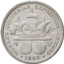
Stars on the reverse are even a greater mystery. According to documentation there were to be thirty-six stars, one for each State in the Union at the end of the war. The original design shows all thirty-six. But in the fight between Borglum and Fraser and the creation of a modified version one star was lost and the final design only has thirty-five.
To make matters worse Borglum made the field level uneven to represent the mountain and the stars were not intended to be strongly represented. As a result it is rare to find a coin where all thirty-five stars can be counted, even in grades as high as Mint State 66 they are often missing.
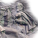
The Final Design
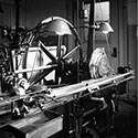
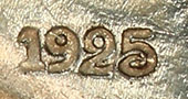
In his article in November 1977 in "The Numismatist," Radford Stearns gave an illustration of the final galvano plates used to create the coin hubs. These were dated 1924, so others had to be completed with the 1925 date before production proceeded.
Click on the image for a larger view
These are not great images of the galvano so we are searching for others. But an interesting note is that all the features were created prior to hub production and nothing added by a punch. This might explain some of the soft features on the coin since the transfer lathe may have produced less precise images than a punch.
Legal Stuff
Home
History
Our Collection
Exonumia
The Coin
Original Design
Modifications
Grading
Price Guide
The Carvers
Contact Us
The Carving
Coins by Grade
Sources
Commemoratives
Statistics
Variations
Final Design Issues
Production
Harvest Campaign
Copyright (c) Georgia 1832,LLLP 2018-2018