
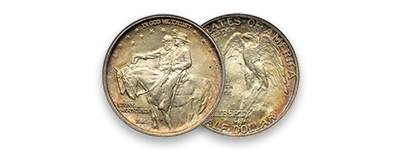
Stone Mountain
Commemorative Half Dollar
Original
Design


The Coin
Original Design
Modifications
Final Design
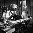
Production
A Tale of Five A's
Variations
Obverse Dies
Reverse Dies
Harvest Campaign
Counterstamp
Varieties
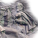
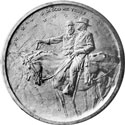
In the National Archives there is a representation of the original design for the coin ultimately executed as the one we see today. This design had more of the Gutzon Borglum flavor to it and to our eye looks more like a commemorative medal than a coin. In the final rendition there were changes that removed some of the detail and made the design work better.
However, getting to this point was not easy and the temperamental side of Borglum and the Mint's chief engraver, James Earl Fraser, came into play. Each was opinionated, each had something to offer, and neither saw eye-to-eye on the original or final version.
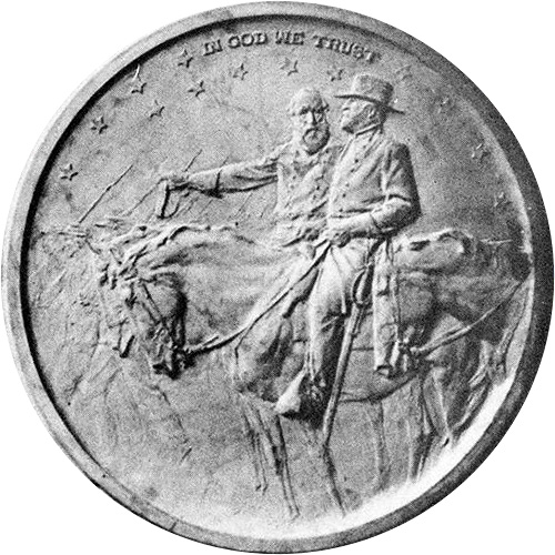
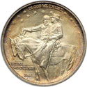
The original design for the obverse was like a circular slice out of the carving that Borglum had planned. There are many notable differences.
First, Jackson and Lee are sitting beside a column of men that can be seen marching in the background with their rifles.
Second, there is a third horse coming in from the right, presumably that of Jefferson Davis.
Third, the stars, people, and wording seem crisper in this rendering.
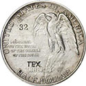
Fourth, the lettering of "IN GOD WE TRUST" is much smaller, but too small to be rendered on a coin without being completely unreadable
Finally, the date has been moved to the reverse, and the words "STONE MOUNTAIN" are missing.
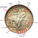
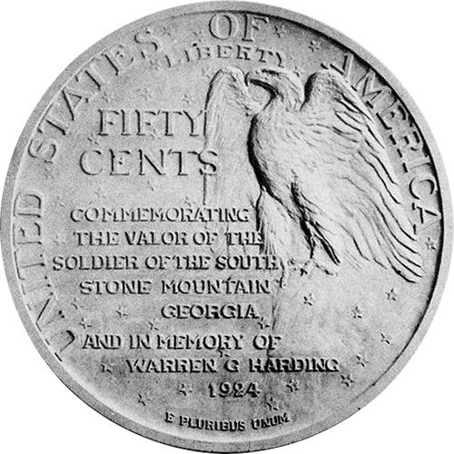
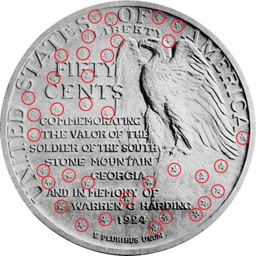
The original design for the obverse has just as even more changes.
First, the denomination was shown as "FIFTY CENTS and is much higher in the design.
Second, the word "LIBERTY" is much smaller and sits high in the design.
Third, the long motto includes "STONE MOUNTAIN" which was moved to the obverse, and the word "COMMEMORATING" was changed to "MEMORIAL"
Fourth, the tribute to President Warren G. Harding was there because of his death and to "sell" the coin idea to Congress. It was deemed inappropriate and removed by President Calvin Coolidge.
Fifth, the date was moved to the obverse.
Sixth, the eagle's wings are very different. The right wing is too vertical and was opened more. The left wing sweeps like hair and was made more vertical toward the end of the wing.
Finally, the stars are somewhat bolder and extend to the rock the eagle is perched on to balance the presentation more. And believe it or not, we count thirty-six which would coincide with the number of states in the Union at the end of the war. So somewhere between the two designs a star was dropped or was made so faint we cannot find it.
Legal Stuff
Home
History
Our Collection
Exonumia
The Coin
Original Design
Modifications
Grading
Price Guide
The Carvers
Contact Us
The Carving
Coins by Grade
Sources
Commemoratives
Statistics
Variations
Final Design Issues
Production
Harvest Campaign
Copyright (c) Georgia 1832,LLLP 2018-2018