
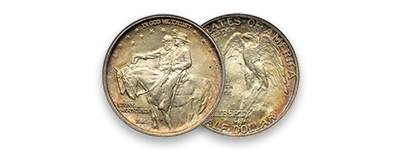
Stone Mountain
Commemorative Half Dollar
A Tale of
Five A's
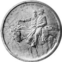
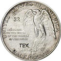


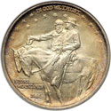
The Coin
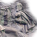
Original Design
Modifications
Final Design
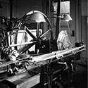
Production
A Tale of Five A's
Variations
Obverse Dies
Reverse Dies
Harvest Campaign
Counterstamp
Varieties
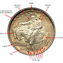
At some point in the process of arguing between Gutzon Borglum and the U. S. Commission of Fine Arts, or in translating the coin design to the dies, a small change was made to the lettering on the reverse that seems to have been overlooked.
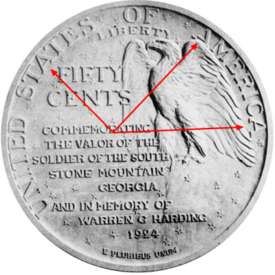 In Borglum's designs the letter A is almost always of a specific type where the horizontal bar is in the lower third of the letter.
The design also had only three A's and there is just a little variation in their design. The A in STATES and the first A in AMERICA appear to be of the same design. But on the last A in AMERICA the horizontal bar is slightly higher in the letter closing down the triangle formed by the sides and horizontal bar.
At first we thought this was to distinguish capital A from little A. But this is not correct because the two most similar are in position to contradict that assumption.
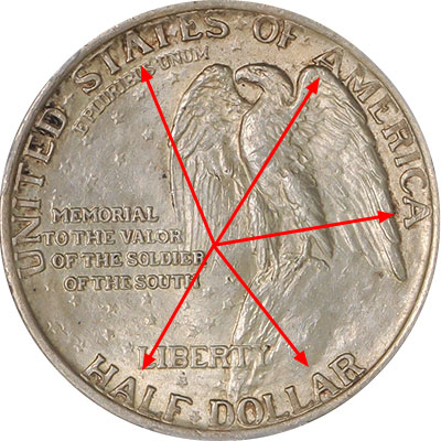 But when the final design was approved after all the arguments with Borglum, there were some interesting changes.
- First, the words FIFTY CENTS was changed to HALF DOLLAR, effectively adding two more A's.
- Second, the form of the letters changed from two to four different varieties and the changes were pronounced enough as to be obvious to the eye with no magnification once you realize the difference.
To our knowledge no image of Borglum's final working model has surfaced, so we only have the coin as struck as guidance. The changes could have been made by Borglum, a Mint worker, the Medallic Art Company, or the U. S. Commission of Fine Arts.
In the word AMERICA the A's appear to be unaltered and although different from the other A's, they were the same as Borglum's model.
Type 1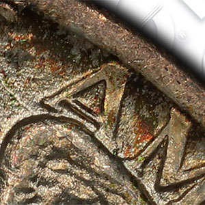
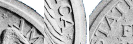
The A at the beginning of the word AMERICA is different than all the others. The triangle at the top of the letter is more of an equilateral triangle, but the horizontal crossbar is much lower. It is this A that most closely resembles the one intended by Borglum.
 Type 2
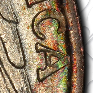
The A at the end of the word AMERICA is different than all the others. The triangle at the top of the letter is smaller, but still an equilateral triangle.
 Type 3
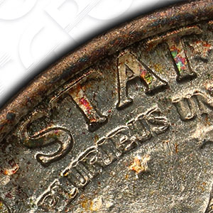
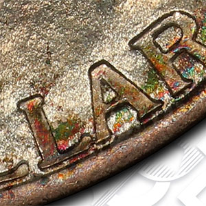
But in the Word STATES the A transformed from one that matched the first A in AMERICA to a totally different A. This A has a much higher crossbar creating an isosceles triangle at the top, but it often appears in a teardrop shape and just stands alone.
 Type 4
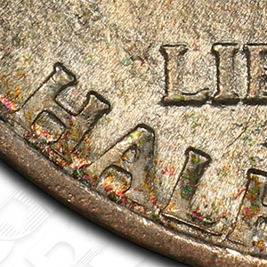
The A in the word HALF most resembles the A in DOLLAR only. The crossbar is slightly lower and thicker than the one in STATES. It still creates an isosceles triangle but slightly larger than Type 3.
 Type 4
The A in the word DOLLAR most resembles the A in HALF only. It still creates an isosceles triangle but slightly larger than Type 3.
Legal Stuff
Home
History
Our Collection
Exonumia
The Coin
Original Design
Modifications
Grading
Price Guide
The Carvers
Contact Us
The Carving
Coins by Grade
Sources
Commemoratives
Statistics
Variations
Final Design Issues
Production
Harvest Campaign
Copyright (c) Georgia 1832,LLLP 2018-2018